


I attended the UXINDIA conference on 4-5th November. UXINDIA is hosted by UMO Design every year. I had a good time attending the workshops, talks and conversations with designers. this blog is just a digital diary for some takeaways from the conference.
The 2 most interesting workshops that I attended were the design thinking workshop by Kavitha Appaya and the doodling workshop by Rohit Soni. Definitely a few things that would stick with me subconsciously from time to time.
Key takeaways from Kavitha's workshop:
1. Drawing inspiration from nature, objects around us or our surroundings AKA Biomimicry:
all amazing things are designed by copying/ trying to replicate what we already know or learn. we often tend to advocate and see copying in a bad light, but look at some of the best examples, and voila!
Def: Biomimicry- looking for solutions to problems or challenges by using the patterns of nature.
What inspired the airplane designs?
right from saving fuel to reducing air friction, the body of airplanes are designed by mimicking birds.

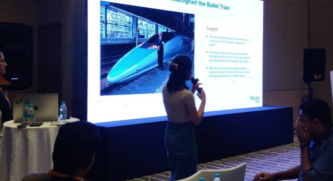
A Birdwatcher who Redesigned the bullet train
how Eiji Nakatsu saved millions of dollars for his company by adapting some features of birds to make bullet trains faster, quieter and cleaner (in terms of fuel).
2. No ideas are dumb until you put them across the table, you never know where, or which idea could redirect you to where you want to reach. Effective brainstorming brings the most amazing set of ideas to the table.
“Throwing spaghetti on the wall” method, what you do is basically keep throwing your ideas on the table until you find what sticks and to finally have a workable set of ideas with you. Do not constrain yourself while you do so, jot down anything and everything that comes to your mind.
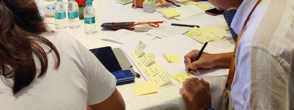
3. World cafe: throughout the workshop, there was this activity which involved brainstorming solutions for building a ride-sharing application, and people kept moving from table to table after adding their ideas to the whiteboard on each table, this way at the end of the workshop, no two tables had the same kind of solutions to the problem statement.
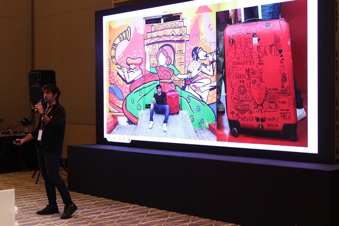
Rohit’s workshop:
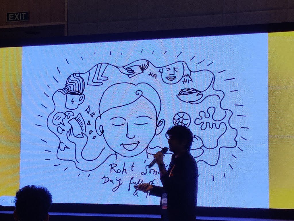
1. Storytelling through doodling: first off, his slide deck was completely made of doodles and no text. This kinda reminded me of Von Restorff Effect which is used in UX: which predicts that when multiple similar objects are present, the one that differs from the rest is most likely to be remembered. As the whole day was packed with almost 30+ talks, I’m sure Rohit's workshop stuck around in people's minds because it stood out from other presentation styles. anyways, it was very refreshing to have some sit back and come through my journey but only with doodles kinda workshop.
And By the time he was done, I realised how smoothly he delivered his content through pictures and doodles. Each of Soni’s doodles has a story to tell, which kinda reminded me to get back to bookmark stories, events and conversations through journaling. We all have that one way of expressing our true innate emotions, experiences, etc and how it's important to channel that area of us in the daily gush.
- Making the best use of your skill. I loved how passionate he is about his skill and how he carved out a career of exactly what he loves and is best at. transitioning from an interaction designer to starting Doodle project.
2. Power of Visuals:
if I ask you: what is a square?
The first thing that pops into your head is an image and not its definition.
Easy to remember/ digest information or reduces information overload.
Easy to present complex ideas.
Promotes better engagement.
Visuals are easily comprehended and therefore are the best way to tell a story.
So do make sure, you include more visual elements in your presentations, blogs, etc next time.
Thank you for reading this far, I hope it was a good read.
link to: design of bullet trains article